

The NBA has transitioned into a somewhat positionless sport. As the years have gone by, more and more teams have continued to employ lineups that don’t contain centers, or utilize point forwards that guard the paint but facilitate the offense. Players have been thought of less and less as “shooting guards” or “power forwards” and more and more as “wings” or “bigs”. We wanted to visualize this massive change in play style by using data science methods to compare the play style of the current NBA to that of the NBA in the 1980s. Through unsupervised learning, we were able to see how the clustering of player data by position has changed over time, and what that says about how the play style of the league has evolved.
Sections include: Data Preparation, Exploratory Data Analysis, Analysis Method, Results, Conclusion and Reflection, and Code Used. Feel free to skip to whichever part you’re interested in!
Data Preparation
The data that we chose to analyze was NBA player data pulled from Basketball Reference. This data is split into two sets: NBA player data from the 1981 season through the 1990 season and NBA player data from the 2011 season through the current 2020 season. We pulled in the following box score statistics as distinct variables from those data: points, assists, offensive rebounds, defensive rebounds, steals, turnovers, personal fouls, and blocks. These box score statistics were scaled per 100 possessions. We decided to use per-100 possession data, as opposed to per-game or per-36 minute data, in order to get as accurate and unskewed comparisons as possible (e.g. the pace of the game has increased over the past few decades, which would likely confound the model and interfere with scaling statistics). We also pulled in some shooting percentage statistics: field goal percentage, three point field goal percentage, two point field goal percentage, and free throw percentage. Outside of the box score statistics, we also pulled in the variables of games played and minutes played for purposes of filtering and exploratory data analysis. Finally, we also ensured that we had players’ names and the positions that they played during the season, so that we could identify individual points in our eventual charts.
Before we began our analysis, we had to finalize our dataset and prepare it for modeling. First, to ensure each row was unique, we built a unique identifier by player name and the specific year in which they played (LeBron James, for example, is represented 10 separate times in the 2010s dataset). Second, we checked for missing values, discovering that there were no missing values for any of the data points and attributes. Then, we standardized (normalized) our data so that no single statistic had too much influence over our analysis, which is crucial for our chosen method, multidimensional scaling. Based on our data, we decided that multidimensional scaling would offer us the best visualization for positional differences to answer our problem statement.
Exploratory Data Analysis
Upon a visual first pass at the data, we discovered that there are more possible categorical values available for the position played variable in the 2010s than there were in the 1980s. This was already a good indication that we were on the right path, and that NBA basketball in the 2010s is less dependent on the 5-position style of basketball. However, we had to assign these hybrid positions/positionless players to one of the standard 5 positions so that we were consistent between the decades in terms of the options that are available for a player’s position. This standardization was required to allow for a fair visual comparison between the decades when visualizing the multidimensional scaling model. Therefore, we instituted a rule that a hybrid position will be treated as the “smaller” position and changed as such in the data. For example, a C/PF will be changed to a PF and a SG/PG will be changed to a PG. We carried out this change within the dataset itself.
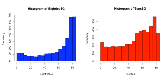
Based on the histograms for games played above, we concluded that a cutoff of 20 games would retain the bulk of the relevant data while still paring down our datasets to eliminate extraneous players whose short seasons were not fully representative. The heavy left-skew of the histograms back up the idea that players who play fewer than 20 games can be considered outliers and could potentially distort our findings. They also provide an interesting side-study in that players in the 1980s on average played far more games over the course of the season (high frequency of data points toward the right of the histogram) when compared to players in the 2010s. The game has changed in this way as well, as load management has altered the way coaches and front offices deploy their players.
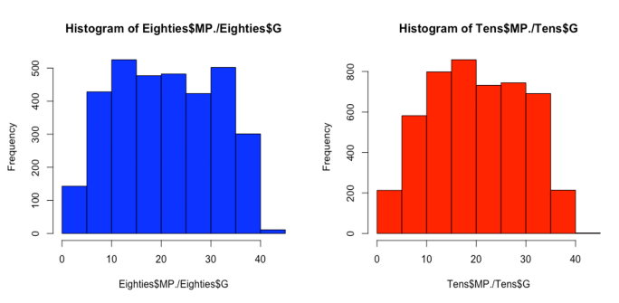
The histograms for minutes played per game indicated that there is an even spread and mostly normal distribution from 0 to 40 minutes played per game. As such, our original assertion that we would eliminate players who had played fewer than 20 minutes per game would eliminate a large bulk of our data, and could be considered data manipulation. However, through our understanding of the nature of the dataset, we believe that the removed values represent bench players who are not strongly representative of their given positions, and as such would distort our findings. These players, although there are many of them, do not play enough minutes to result in sufficient box score statistics to have a significant effect on our groupings or to be representative of the positions that they play. Additionally, the statistics accrued during these short minutes totals, when standardized both by the usage of per-100 possession metrics and the later normalization of all of our data for multidimensional scaling, could represent extrapolation of small sample sizes, and eat at the robustness of our study.
Filtering out players with fewer than 20 games played and who played fewer than 20 minutes per game resulted in a larger dataset for the 2010s than for the 1980s. This was expected based on the histograms of games played shown above. Despite the differences, the two datasets for the two decades are reasonably close to 2,000 data points each.
Analysis Method
After filtering and normalizing our two datasets accordingly, we moved into our multidimensional scaling. Using the cmdscale() function from R’s Stats package, we were able to seamlessly calculate the Euclidean distances between each player in our dataset based on the box score statistics chosen. Multidimensional scaling then allows us to convert this huge matrix of distances into visualizations of points, where the distances between points (individual players) on the plots are proportional to the Euclidean distances calculated within the dataset. In this way, we can visualize how similar or dissimilar individual players are from one another, and study on aggregate how these similarities change (or don’t) across positions. There are plenty of other unsupervised methods like this within data science (principal components analysis, etc.) which use different methods (e.g. correlation instead of Euclidean distance) to get to similar ends, but we settled on MDS due to both its ease of use in R and our personal preference for distance methods as a measure of dissimilarity.
Results
Now for the actual results – below are the initial MDS plots, with each numbered point representing a player season (more accurately, their normalized per-100 statistics). Note that the axes of the graph don’t represent “real” metrics; they’re created under the hood within the MDS itself and are mostly irrelevant for our results. The two charts:
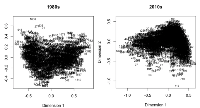
Clearly, there’s not much to see above; just a smattering of points. However, we can use R’s ggplot2 package to separate the points out by position, a segmentation that allows us to begin to tell our story:
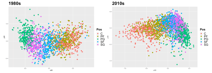
It’s still very much all over the place, but a closer look can begin to uncover patterns. Notice how in the 1980s, points of each respective color (representing players of respective positions) tend to stay more huddled with their own kind, whereas in the 2010s, there’s a lot more leaking across areas. It’s almost as if in the chart on the left, someone was coloring in between the lines, and on the right the watercolors spread everywhere. This begins to get to our hypothesized result that the calculated similarities between points have become less mapped to position in the more recent decade than they had been in the past.
To dig deeper, we can plot only the points belonging to specific positions. First, we can look at the two most “different” positions in the NBA, center and point guard:
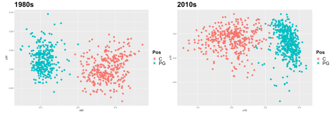
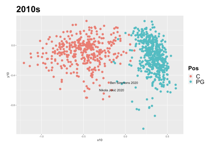
Center and point guard are the extreme example – it’s hard to get more different within the game of basketball. As such, the points are pretty clearly separated from one another in both decades. However, you can begin to see some leaks here – on the left, there’s really no overlap whatsoever, whereas on the right there are a few blue points in the red zone and vice versa. One interesting sub-note here is that there is some within-position interest in these charts as well – in both decades, the centers cluster with each other more tightly than do the point guards. This lends itself to the argument that on average, point guards have been more “versatile” than centers, in terms of the box score statistics studied, consistently across time. We have some suspected culprits here in 2020, Ben Simmons (PG) and Nikola Jokić (C):
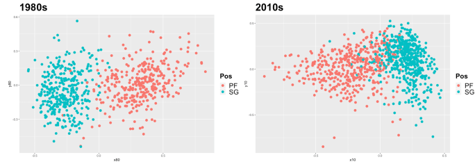
The lines begin to blur for each decade as we move to analyzing the differences between power forwards and shooting guards. As the clusters begin to converge for the 1980s, they do to a far greater extent for the 2010s. While in the 1980s we see a noticeable number of errant points for power forwards begin to infiltrate the cluster of shooting guards, and vice versa, we see large sections of the clusters for power forwards and shooting guards intermingle for the 2010s. This offers clear visual evidence for the decreased differences between two different positions from the 1980s to the 2010s.
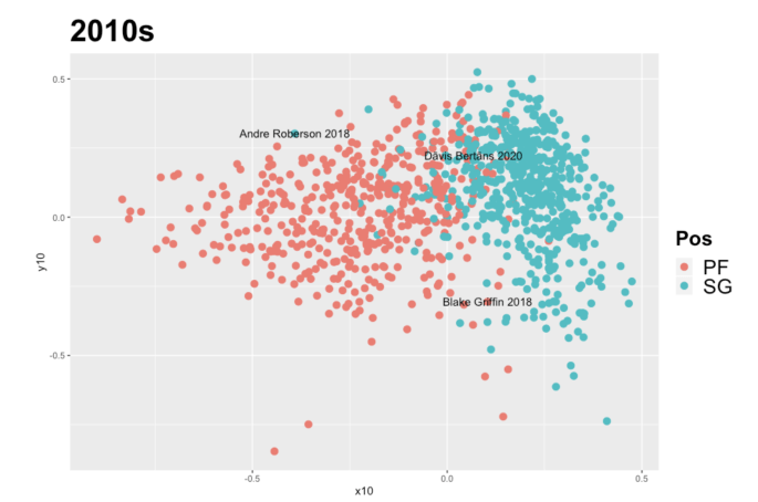
Case studies here include Andre Roberson (SG), Dāvis Bertāns (PF), and Blake Griffin (PF):
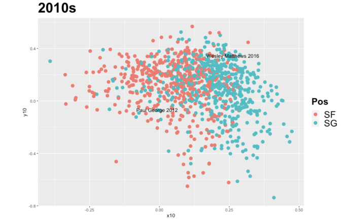
Analysis of positions that are more similar produce clusters that overlap more. The graphs below show the strongest transition from position-based basketball to positionless basketball so far:
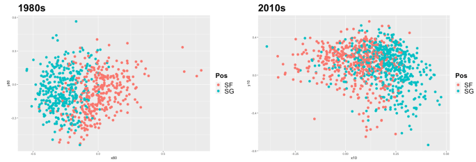
For the 1980s, the clusters for shooting guards and small forwards overlap significantly, but remain visually distinct. However, the same visualization for the 2010s shows almost indistinguishable clusters for shooting guards and small forwards. At this point, basketball fans of the recent decade may not themselves be able to distinguish which player was even playing which position. Paul George (SG) and Wesley Matthews (SF) don’t stay put on their sides of the chart:
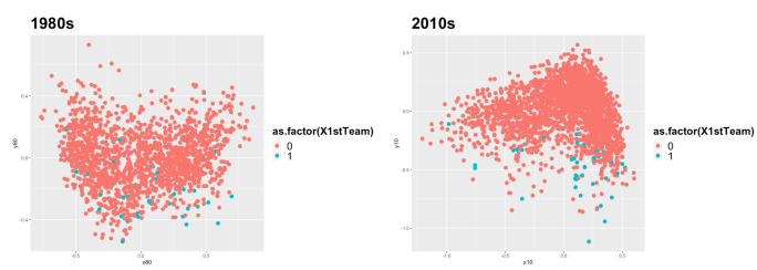
We also highlighted observations for players who were selected to the All-NBA first team for each year. There is not a specific grouping of players by efficiency or recognized contribution. This indicates that better players do not necessarily cluster together based on box score statistics, and removes player performance as a contributing factor to the clear patterns that we’ve identified in our visualizations:
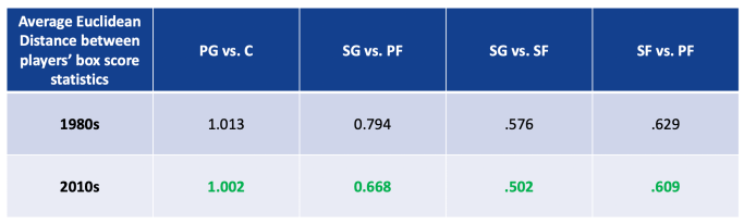
While it’s one thing to see clearly in visuals what is happening, we also thought it would be prudent to be able to determine whether a clearly distinguishable statistical difference had been established between players’ box scores from the two decades. Below, we compiled a table comparing the average Euclidean distance between positions from the charts shown above. This in-one metric tells us how “different” each position was from each other, on average, in each decade. Unsurprisingly, the average distances are smaller in the 2010s across each of our 4 comparisons:
Conclusion and Reflection
The model proved to be high quality and provided strong findings to address our problem statement. The data clustered in such a way that showed clear divisions between data points for each position relative to the other positions during the 1980s. Similar divisions appeared for the 2010s, but overlapped to a much higher degree. We first validated this model by calculating metrics that put numbers to these observations. The calculated differences between clusters lended numerical validation to the conclusions that resulted from the graphs. We also validated the model by our understanding of the data and of basketball during the 1980s and 2010s. The data showed strong groupings of statistics by position, as expected based on our contextual knowledge of basketball. The data also showed the previously explained differences of those groupings for each decade. Strong context is a prerequisite to the use of unsupervised data analysis, and the model strongly complemented the context of the data.
There is little to recommend for further studies due to the strength of the model as presented in this study. However, the usefulness of the findings could prompt future study into the other decades and a thorough analysis of how these clusters change not only decade-over-decade, but year-over-year. Additionally, while we addressed many sub-questions in this study, there is a great opportunity to follow-up on the conclusions of this model as it pertains to player and team performance. We addressed our problem statement, but much more analysis could be done to address how positionless basketball influences team success.
Much was learned over the course of this study, not only about basketball but also about data preparation and multidimensional scaling. First, we learned a great deal about how to use our understanding of the data to properly filter our dataset regardless of standard exploratory data analysis techniques. Based on histograms alone, we would not have filtered out players who play less than 20 minutes per game. However, because we understand how bench players are utilized in the NBA, we knew that these data points would be detrimental to our study and irrelevant for our problem statement. We also discovered how valuable multidimensional scaling can be when visualized in different ways. The color-coding of the graphs is what truly uncovered the beneficial conclusions that existed within our data. Using ggplot2, we were able to expand our understanding of the benefits and flexibility of multidimensional scaling in a real-world context. Finally, we learned a great deal about model validation when faced with the issue of formally showing the results that we claimed based upon the appearance of our graphs. It took research, but based on what we learned in this class, we landed on the use of euclidean distances to show on a table what we saw on the graphs themselves. This study provided us with a great opportunity to learn not only about unsupervised learning, but also about the NBA, which is something that the both of us care about greatly.
by Derek Reifer and Duncan Holmes, Northwestern University
Code Used
rm(list=ls())
Tens<-read.csv(“Tens.csv”)
Eighties<-read.csv(“Eighties.csv”)
hist(Tens$MP.,col=”red”)
hist(Eighties$MP.,col=”blue”)
hist(Tens$MP./Tens$G,col=”red”)
hist(Eighties$MP./Eighties$G,col=”blue”)
hist(Tens$G,col=”red”)
hist(Eighties$G,col=”blue”)
summary(Tens)
Tens<-Tens[Tens$MP./Tens$G>=20,]
Tens<-Tens[Tens$G>=20,]
summary(Tens)
Eighties<-Eighties[Eighties$MP./Eighties$G>=20,]
Eighties<-Eighties[Eighties$G>=20,]
names(Tens)
Tens<-Tens[,c(“Pos”,”FG.”,”X3P.”,”FT.”,”ORB”,”DRB”,”AST”,
“STL”,”BLK”,”TOV”,”PF”,”PTS”,”ID”,”X1stTeam”)]
names(Tens)
Eighties<-Eighties[,c(“Pos”,”FG.”,”X3P.”,”FT.”,”ORB”,”DRB”,”AST”,
“STL”,”BLK”,”TOV”,”PF”,”PTS”,”ID”,”X1stTeam”)]
normalize <- function(x) {
return ((x – min(x)) / (max(x) – min(x)))
}
Tens$FG.<-normalize(Tens$FG.)
Tens$X3P.<-normalize(Tens$X3P.)
Tens$FT.<-normalize(Tens$FT.)
Tens$ORB<-normalize(Tens$ORB)
Tens$DRB<-normalize(Tens$DRB)
Tens$AST<-normalize(Tens$AST)
Tens$STL<-normalize(Tens$STL)
Tens$BLK<-normalize(Tens$BLK)
Tens$TOV<-normalize(Tens$TOV)
Tens$PF<-normalize(Tens$PF)
Tens$PTS<-normalize(Tens$PTS)
Eighties$FG.<-normalize(Eighties$FG.)
Eighties$X3P.<-normalize(Eighties$X3P.)
Eighties$FT.<-normalize(Eighties$FT.)
Eighties$ORB<-normalize(Eighties$ORB)
Eighties$DRB<-normalize(Eighties$DRB)
Eighties$AST<-normalize(Eighties$AST)
Eighties$STL<-normalize(Eighties$STL)
Eighties$BLK<-normalize(Eighties$BLK)
Eighties$TOV<-normalize(Eighties$TOV)
Eighties$PF<-normalize(Eighties$PF)
Eighties$PTS<-normalize(Eighties$PTS)
TensNums<-Tens[,c(“FG.”,”X3P.”,”FT.”,”ORB”,”DRB”,”AST”,
“STL”,”BLK”,”TOV”,”PF”,”PTS”)]
EightiesNums<-Eighties[,c(“FG.”,”X3P.”,”FT.”,”ORB”,”DRB”,”AST”,
“STL”,”BLK”,”TOV”,”PF”,”PTS”)]
TensDist<-dist(TensNums)
EightiesDist<-dist(EightiesNums)
head(TensDist)
TensDistM<-as.matrix(TensDist)
EightiesDistM<-as.matrix(EightiesDist)
hist(TensDistM,col=”red”)
hist(EightiesDistM,col=”blue”)
fitTens <- cmdscale(TensDist, eig=TRUE, k=2)
fitEighties <- cmdscale(EightiesDist, eig=TRUE, k=2)
library(ggplot2)
x10 <- fitTens$points[,1]
y10 <- fitTens$points[,2]
ggplot(data.frame(cbind(x10,y10,Tens)), aes(x = x10, y = y10)) +
geom_point(aes(col=Pos),size=3)+ggtitle(“2010s”)+
theme(plot.title = element_text(size = 30, face = “bold”),
legend.title = element_text(size = 20, face = “bold”),
legend.text=element_text(size=20))
x80 <- fitEighties$points[,1]
y80 <- fitEighties$points[,2]
ggplot(data.frame(cbind(x80,y80,Eighties)), aes(x = x80, y = y80),size=3) +
geom_point(aes(col=Pos),size=3)+ggtitle(“1980s”)+
theme(plot.title = element_text(size = 30, face = “bold”),
legend.title = element_text(size = 20, face = “bold”),
legend.text=element_text(size=20))
pointsToLabel <- c(“Nikola Jokić 2020″,”Ben Simmons 2020″)
ggplot(data.frame(cbind(x10,y10,Tens))[Tens$Pos==”PG”|Tens$Pos==”C”,],
aes(x = x10, y = y10)) +
geom_point(aes(col=Pos),size=3)+
ggtitle(“2010s”)+
theme(plot.title = element_text(size = 30, face = “bold”),
legend.title = element_text(size = 20, face = “bold”),
legend.text=element_text(size=20))+
geom_text(aes(label = ID),
data = data.frame(cbind(x10,y10,Tens))[Tens$ID %in% pointsToLabel,])
ggplot(data.frame(cbind(x80,y80,Eighties))[Eighties$Pos==”PG”|
Eighties$Pos==”C”,], aes(x = x80, y = y80)) +
geom_point(aes(col=Pos),size=3)+ggtitle(“1980s”)+
theme(plot.title = element_text(size = 30, face = “bold”),
legend.title = element_text(size = 20, face = “bold”),
legend.text=element_text(size=20))
pointsToLabel <- c(“Blake Griffin 2018″,”Andre Roberson 2018”,
“Dāvis Bertāns 2020″)
ggplot(data.frame(cbind(x10,y10,Tens))[Tens$Pos==”PF”|
Tens$Pos==”SG”,], aes(x = x10, y = y10)) +
geom_point(aes(col=Pos),size=3)+ggtitle(“2010s”)+
theme(plot.title = element_text(size = 30, face = “bold”),
legend.title = element_text(size = 20, face = “bold”),
legend.text=element_text(size=20))+
geom_text(aes(label = ID),
data = data.frame(cbind(x10,y10,Tens))[Tens$ID %in% pointsToLabel,])
ggplot(data.frame(cbind(x80,y80,Eighties))[Eighties$Pos==”PF”|
Eighties$Pos==”SG”,], aes(x = x80, y = y80)) +
geom_point(aes(col=Pos),size=3)+ggtitle(“1980s”)+
theme(plot.title = element_text(size = 30, face = “bold”),
legend.title = element_text(size = 20, face = “bold”),
legend.text=element_text(size=20))
pointsToLabel <- c(“Paul George 2012”, “Wesley Matthews 2016″)
ggplot(data.frame(cbind(x10,y10,Tens))[Tens$Pos==”SF”|
Tens$Pos==”SG”,], aes(x = x10, y = y10)) +
geom_point(aes(col=Pos),size=3)+ggtitle(“2010s”)+
theme(plot.title = element_text(size = 30, face = “bold”),
legend.title = element_text(size = 20, face = “bold”),
legend.text=element_text(size=20))+
geom_text(aes(label = ID),
data = data.frame(cbind(x10,y10,Tens))[Tens$ID %in% pointsToLabel,])
ggplot(data.frame(cbind(x80,y80,Eighties))[Eighties$Pos==”SF”|
Eighties$Pos==”SG”,], aes(x = x80, y = y80)) +
geom_point(aes(col=Pos),size=3)+ggtitle(“1980s”)+
theme(plot.title = element_text(size = 30, face = “bold”),
legend.title = element_text(size = 20, face = “bold”),
legend.text=element_text(size=20))
ggplot(data.frame(cbind(x10,y10,Tens))[Tens$Pos==”SF”|
Tens$Pos==”PF”,], aes(x = x10, y = y10)) +
geom_point(aes(col=Pos))+ggtitle(“2010s”)
ggplot(data.frame(cbind(x80,y80,Eighties))[Eighties$Pos==”SF”|
Eighties$Pos==”PF”,], aes(x = x80, y = y80)) +
geom_point(aes(col=Pos))+ggtitle(“1980s”)
head(data.frame(cbind(x10,y10,Tens))[])
idx10 <- as.matrix(expand.grid(which(Tens$Pos==”PG”), which(Tens$Pos==”C”)))
mean(as.matrix(TensDist)[idx10])
idx80 <- as.matrix(expand.grid(which(Eighties$Pos==”PG”), which(Eighties$Pos==”C”)))
mean(as.matrix(EightiesDist)[idx80])
idx10 <- as.matrix(expand.grid(which(Tens$Pos==”SG”), which(Tens$Pos==”PF”)))
mean(as.matrix(TensDist)[idx10])
idx80 <- as.matrix(expand.grid(which(Eighties$Pos==”SG”), which(Eighties$Pos==”PF”)))
mean(as.matrix(EightiesDist)[idx80])
idx10 <- as.matrix(expand.grid(which(Tens$Pos==”SG”), which(Tens$Pos==”SF”)))
mean(as.matrix(TensDist)[idx10])
idx80 <- as.matrix(expand.grid(which(Eighties$Pos==”SG”), which(Eighties$Pos==”SF”)))
mean(as.matrix(EightiesDist)[idx80])
idx10 <- as.matrix(expand.grid(which(Tens$Pos==”SF”), which(Tens$Pos==”PF”)))
mean(as.matrix(TensDist)[idx10])
idx80 <- as.matrix(expand.grid(which(Eighties$Pos==”SF”), which(Eighties$Pos==”PF”)))
mean(as.matrix(EightiesDist)[idx80])
First10=subset(Tens,X1stTeam=1)
First80=subset(Eighties,X1stTeam=1)
ggplot(data.frame(cbind(x10,y10,Tens)), aes(x = x10, y = y10)) +
geom_point(aes(col=as.factor(X1stTeam)),size=3)+ggtitle(“2010s”)+
theme(plot.title = element_text(size = 30, face = “bold”),
legend.title = element_text(size = 20, face = “bold”),
legend.text=element_text(size=20))
ggplot(data.frame(cbind(x80,y80,Eighties)), aes(x = x80, y = y80),size=3) +
geom_point(aes(col=as.factor(X1stTeam)),size=3)+ggtitle(“1980s”)+
theme(plot.title = element_text(size = 30, face = “bold”),
legend.title = element_text(size = 20, face = “bold”),
legend.text=element_text(size=20))

2 thoughts on “Visualizing the NBA’s Trend Toward Positionless Basketball”